0203 667 8349
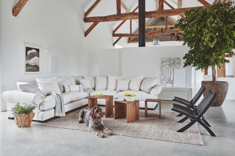
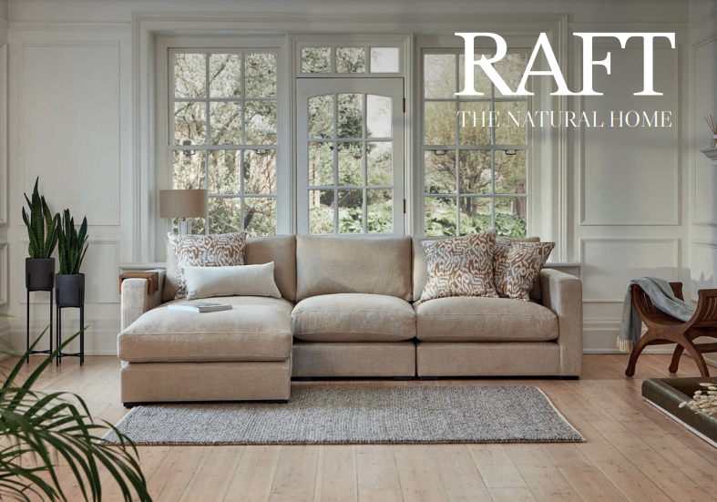


How to create a mood board, according to the design experts at RAFT

Embarking on an interior design project requires clarity on your creative process. This may sound like a seemingly impossible task when you've got hundreds of ideas in mind, but the secret is simple: create a mood board. Inspiration is everywhere and condensing themes visually is an excellent way to establish what works and what doesn't. Whether you're starting a project from scratch or are on a mission to re-accessorise an existing space with a pre-established colour scheme, a mood board is the key to success. This blog will break down expert advice from the design team at Raft. Your creative process needn't wait.
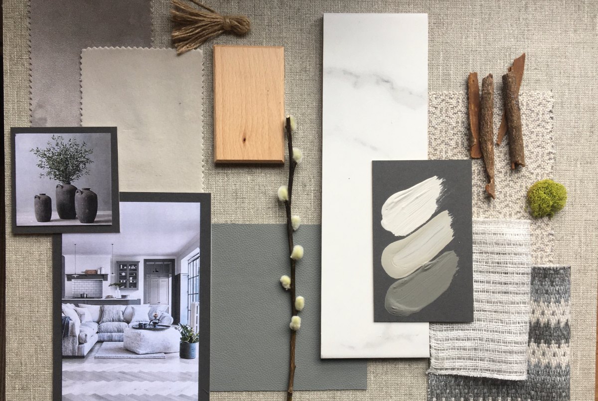
1. Inspiration is personal... be confident in what you love
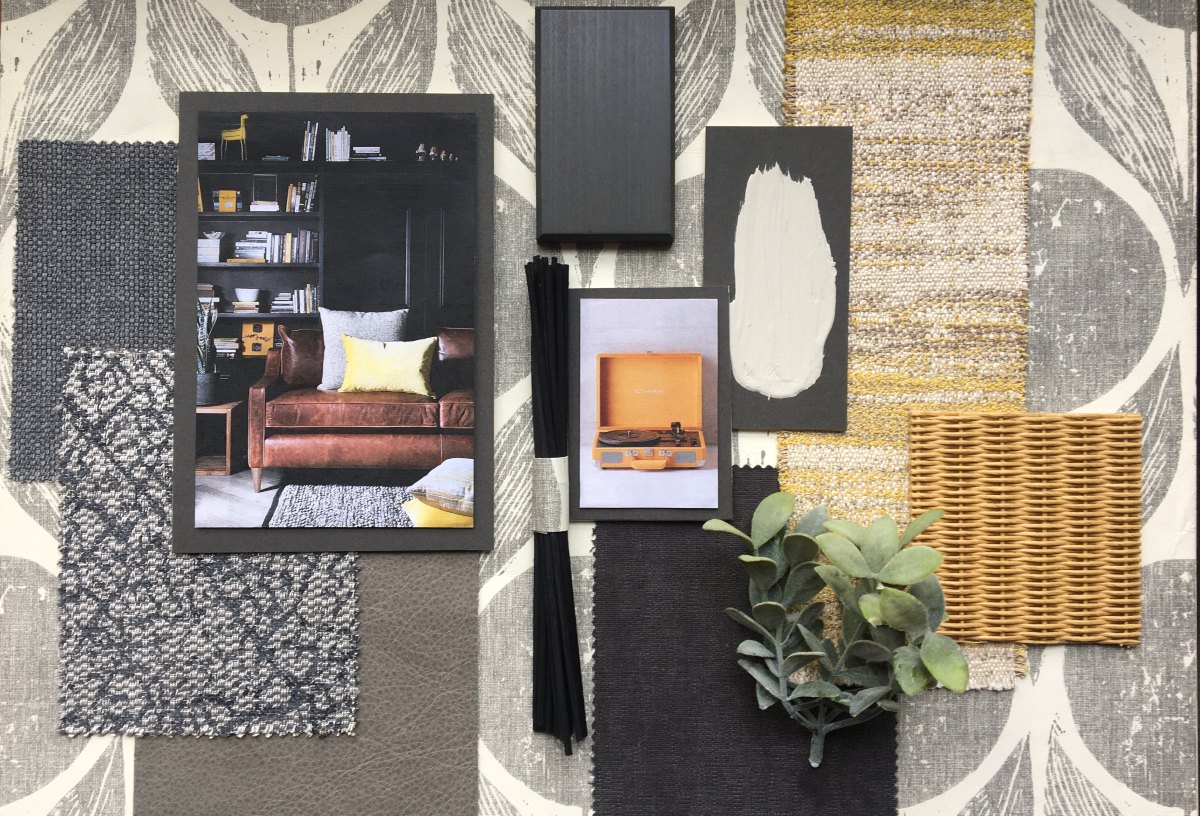 At the end of the day, the purpose of curating a mood board is to collate all your thoughts, ideas and inspiration to create a mini representation of your interior goals. Lubo Todorov, Visual Merchandiser at Raft unveiled his secrets when it comes to searching for inspiration and it proves that there is an unlimited library that can act as stimulus for your creative process, from fashion to art and architecture. "I love people watching and urban fashion; it always gives me ideas for colour and material combinations". We also love the use of house plants on mood boards as they make the space look more real. Another very important step is to include your favourite pieces of art or objects (such as the vinyl player above). Essentially, the biggest items on the board should be those that are most loved; this will serve to inspire as well as keep you motivated for your new interior design project!
2. Establish your base colour
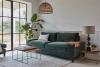
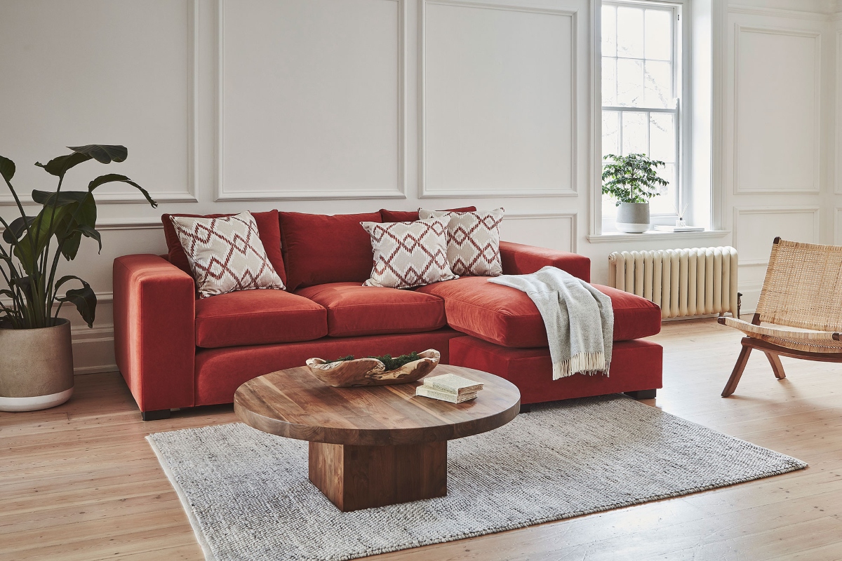
 When it comes to choosing your base colour, you need to consider the underlying theme of your interiors. For the base we like to pick the colour that will dominate the room, be it your walls, flooring or if you're bold enough to work around a curtain/fabric print that you are committed to, bravo! From the base colour it is easy to match your swatches, fabric samples, images and props to the colour scheme. We often go for a more neutrally toned base so that we can work from the bottom up and practise how we might be able to experiment with feature prints and accessories, depending on the season or occasion. However, if your style is bright and bold, that works too. It's an expression of you, remember?
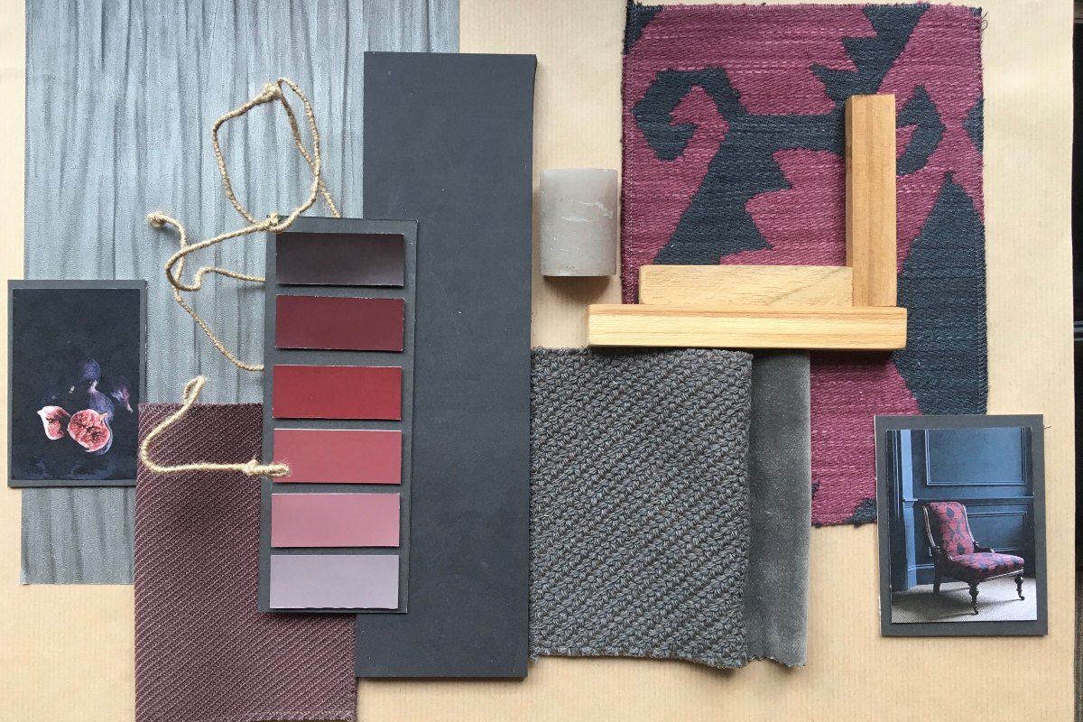
3. Swatches
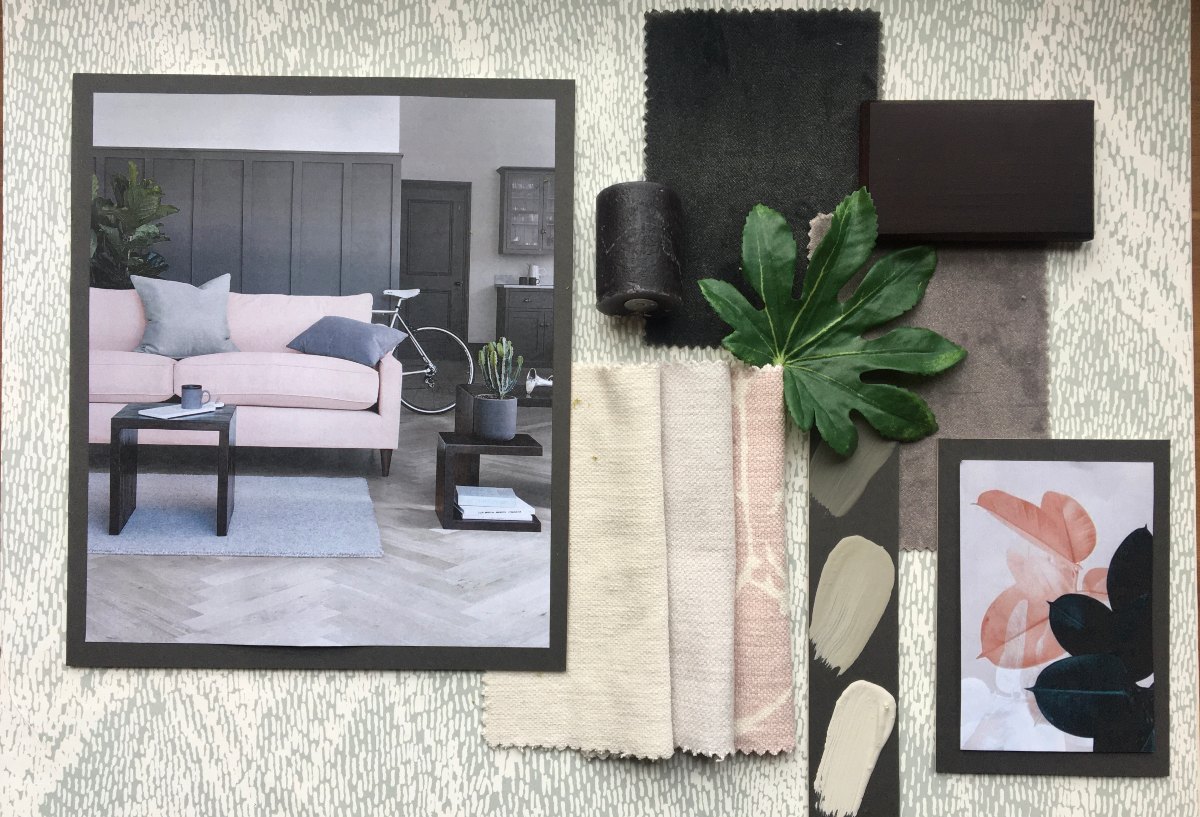 Swatches are the cuts of fabric and the samples of paint that you layer on your mood board to give a feel for the textures and colour palette that you want to incorporate into a space. Regarding textures, it's fun to play around with fabric samples, experimenting with everything from leather to crushed velvet. Layering materials on a small canvas will also give you a feel for how your chosen textures will work together and complement each other in a bigger space. Regarding the colour palette of your swatches, our interior designer, Tamara Frye, loves to match a base colour with some accent colours. She suggests the following ideas to guide your creative process:
COLOURS ACCENT
- Dark Grey - White, Blush, Yellow, silver, dusty rose
- Dark Green - Burnt orange, cream, white, sage
- Navy Blue - Gold, white, baby blue
- White - Black, Graphite, Herringbone, pink, pastel colours
4. Cut outs of inspirational interiors
 As much as you want your room to be individual and represent you before anyone else, it would be a lie to say that none of us find inspiration from Instagram, Pinterest and, well, the Raft blog. So, if there's a particular look that has caught your eye, print out a mini copy of it and paste it onto your mood board. Using this technique will allow you to work out how to incorporate your own spin on a style that speaks to you.
Alternatively, if you're interested in booking an interior design consultation, you can enquire online here.